Stuyvesant Cove Park Guide, 2021
Role Product Designer
Responsibility Field study, ideation, prototyping, hi-fi mockup, hi-fi sketches, design user tests
Tool Figma, Notion, Adobe Photoshop, Illustrator, Google Maps, Usability Hub
Time 4 months
Team Dae Young Kim (Product Designer), Yichan Wang (Product Designer), Joe Chung (Product Designer), Fei Liu (Advisor), Candace Thompson (Client)
Organization Solar One

Overview
Stuyvesant Cove Park (“Stuy Cove Park”) is a small park on the riverbank of the East River in Manhattan, New York City. It is home to many native and indigenous plants, many of which are edible. The park management and volunteers are eager to share the park’s unique resources with their visitors.

Our client & park manager, Candace Thompson
The Stuyvesant Cove Park Guide is Candace’ vision of a crowd-sourced tool for improving engagement with the park that (re)connects people with nature.
It serves two main functions:
Education: Introduce the plants, with an emphasis on plants to forage
Wayfinding: Help visitors navigate the park
View PrototypE →
Deliverables
(1) Park guide
Park info
Plant database
Intro to foraging
(2) Plant education solution
(3) Wayfinding solution
Goals
(1) & (2)
Education & improve plant blindness
Foster foraging culture
Build community
(3)
Improve park goers’ experience
Avoid confusion when navigating
Highlight little known park features/facilities
Users
Winter is the off-season and there were very few park-goers. To gather insight into our users, we conducted interviews with park stewards and veteran volunteers, who are familiar with the demographic. There are five main types:
Neighbors: people who live in the immediate surrounding area
Passerby: commuters, bikers, ferry riders who don’t linger
Volunteers: like-minded community members who come regularly
Foragers: people who come to pick berries and other edible plants
Teachers/students: visiting from a school nearby, usually on a field trip

Archetypes
The three archetypes, neighbors, foragers, and volunteers frequently visit and have developed connections with the park and other park goers. Therefore, they are more likely to utilize and contribute to the park guide.
Personas
To help us understand what tangible issues the park goers might encounter, we created personas based on the archetypes.


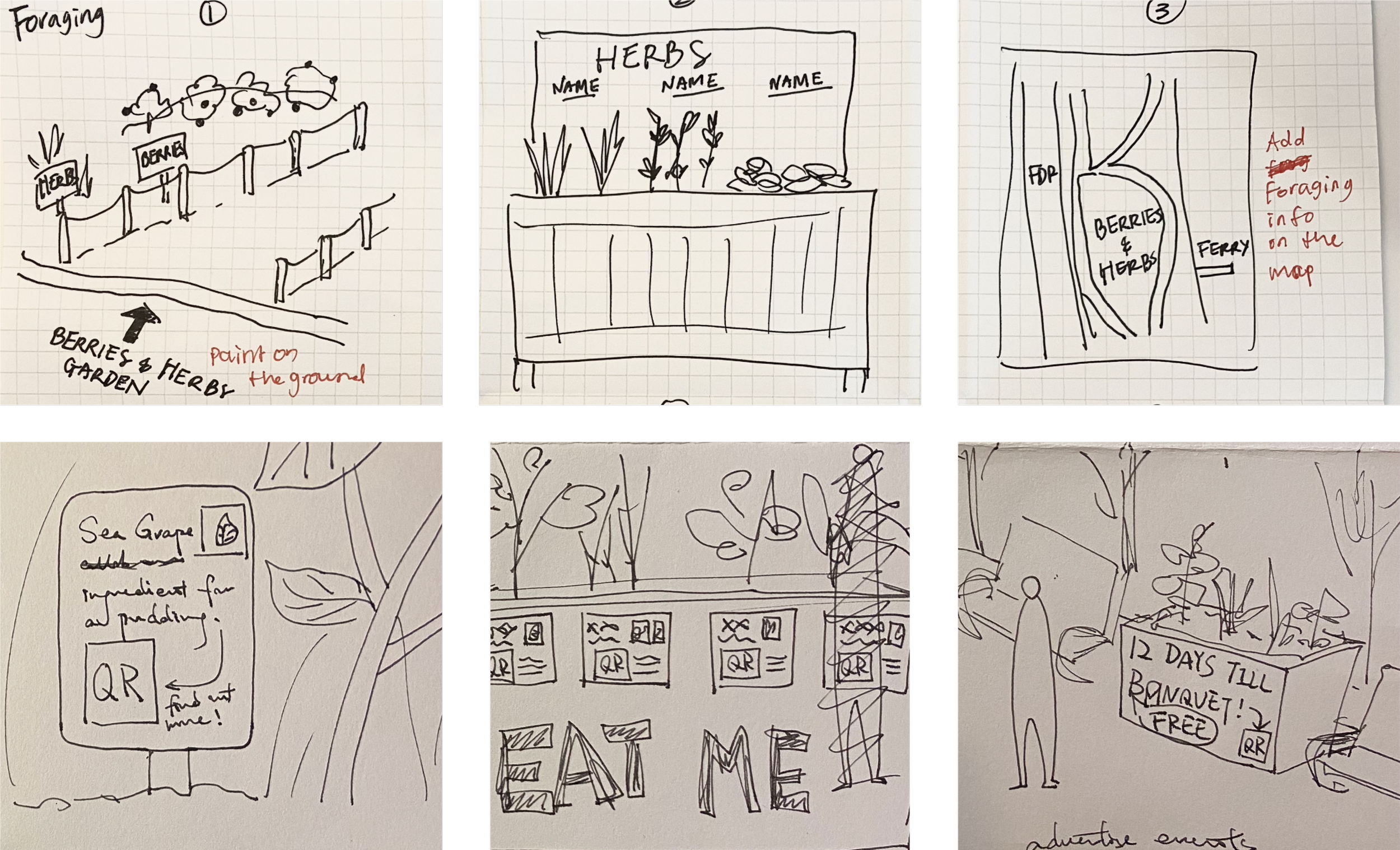
Challenge #1 Getting lost
Stuy Cove Park is currently under construction. It’s happening in phases and in different areas of the park over the next couple of years. The construction has caused issues for visitors to navigate, and some facilities became unavailable/inaccessible.


During our field study, we witnessed a woman with a stroller confused by the roadblocks and various temporary signage put up by the DOC.
It was evident that the official signs are insufficent.
Park Map

Proposed solutions
Wayfinding ideas

Wayfinding implementation mockup

Color coded thermo paint guides

Acrylic signages attached to the wire fence
Challenge #2 Plant blindness
Stuy Cove Park prides itself as home to many indigenous plants and edible plants. There is a teaching garden where the management and volunteers hold workshops, field trips, and other programs in warmer months.

Candace leading workshops
There were laminated plant signages designed and put up by the management. They have been taken down due to weather damage.

Teaching Garden (during winter)
“(The most frustrating thing was) the general disrespect for the park.”
– Ceasar Nash, Park Maintenance
Ceasar told us that he’d see ferry riders trample the garden. Whether or not they did this knowingly or unknowingly, it happens frequently. The management tried addressing this issue by installing obstacles but none availed.
“Urban communities suffer from a lack of connection to both the natural world and to one another”
– Candace Thompson, Park Manager & Living UX
Plant blindness leads to disrespect for nature and negative human-plant interactions. To get to the root of this behavior, it must start with education.
Proposed Solutions
Plant database wireframe & mockup


Plant education ideas
Plant education implementation mockups

Enamel paint fence along the mulch path in the teaching garden

Intro to foraging laminated signs in front of benches
First Proposal
Our team proposed the potential solutions to the client. They were impressed by the possibilities we presented. The client decided to adjust the deliverables.
updated Deliverables
(1) Working park guide & digital map
(2) Wayfinding & education implementation proposal

Prototype
Mockup: custom app

Prototype: Notion

We suggested building the prototype using Notion and Google Maps. They satisfy our client’s current needs. After seeing some key frames and considering the pros and cons, the client supported this idea.

Advantages of using existing tools
Free & easy to use
Existing features
Allows multiple contributors
Easy to maintain
Responsive (mobile compatible)
Disadvantages
Limited customization
Existing UI & UX flaws
Future tool updates
Can not gather insights on engagement
Notion Prototype

Google Maps Prototype

User Testing
We conducted unmoderated user tests on the intuitive usage, accessibility, and information delivery of the design. The tests were done on Usability Hub.
(1) Navigation Test
Purpose:
To evaluate if the custom legend was successful in aiding participants to complete the tasks.
Tasks:
Identify the symbol of portable toilets using the map legend
Return to the map view.
Locate and tap on the portable toilet icon on the map.
Answer question “Does the map legend help you locate what you were looking for? Yes/No”
Answer question “Does the bathroom symbol help you locate the portable toilets on the map? Yes/No”

Results
70% of participants agreed the map legend helped them locate what they were looking for.
70% of participants agreed the bathroom symbol helped them locate the portable toilets on the map.
“I can use it without having to learn how to use it.”
– anonymous participant
Insights
Only 30% of participants clicked the hitzone. The other 70% either clicked the cluster of icons or the search bar. The search bar was a valid action because it is a logical method to locate the portable toilet. However, the toilet icon is, intentionally, not visible in this key frame. Possible reasons are: (1) participants didn’t read/follow instructions, or (2) they tried to zoom in on the image, which is logical to do on the Goolge Maps app.

Takeaway
Custom legend helps users locate what they are looking for.
Users already know how to navigate Google Maps.
There were fundamental flaws in this test: on Usability Hub, it was not possible to use an interactive prototype for the tests.
The instructions we provided are not the only logical method to complete tasks.
(2) 5 Second Impression Test
Purpose:
To evaluate if color coding helps participants skim important information.
Tasks:
Look at the key frame for 5 seconds.
Answer question “What was the page you just saw about?”
Answer question “There were green, yellow, and red tags. What do you think the colors of these tags mean?”

Results
Q1. What was the page you just saw about?
The word cloud of participants’ answers indicated that they were able to extract the purpose of the key frame from the title “List of edible plants in the park” in 5 seconds.

Q2. There were green, yellow, and red tags. What do you think the colors of these tags mean?
Based on the answers, 7 out of 10 participants were able to retain the meaning of the color-coded tags in 5 seconds.

Takeaway
Using color to highlight important information leaves a sufficient impression in users’ minds.
Users understand conventional color coding/color psychology.
Information heirachy helps users skim information.


