Happy Family Night Market Design System, 2022
Role Product Designer, Creative Director
Responsibility Visual Design, Wireframing, Prototyping, UI Kit, Design Guide
Timeline February 2022 - Ongoing
Team David Kim (Dev Lead), Selina Liu (Design Intern), Aly Orescanin (Dev Intern)
Organization Happy Family Night Market
Overview
Project outline
A site relaunch that reflects the organization’s identity and values, and a design system that is streamlined and versatile.
Happy Family Night Market (“HFNM”) celebrates the Asian diaspora and deepens cross-cultural exchange through food, art, and education. The organization supports emerging Asian and Pacific Islander artists, educators, chefs, and social entrepreneurs. HFNM is currently transitioning to a multi-stakeholder co-op.
Responsibilities
I led a design team of 2 and worked alongside an engineer and a creative coder. We structured the timeline into weekly sprints, with design and development progressing simultaneously.
My role was to (1) creatively direct and develop a brand new look for the site, and (2) build a user-friendly design system.
Deliverables
The relaunch is designed, developed, and rolled out in phases. The first phase is to build an adaptive MVP with stable content. This includes reconfiguring the existing sitemap, freshening up the look and feel, and updating the tech stack to be more modern in anticipation of extending its use in the future.
We will continue to design and develop the rest of the website and expand the component library.

Challenge
problems
The design of the website doesn’t represent where the organization currently stands, and can’t support where it’s heading.
HFNM has grown exponentially since its founding in 2018. The existing website followed an identity system designed for print. The simple cookie-cutter site served the purpose of hosting event program and other information.
We analyzed the existing site to identify pain points and inconsistencies. For now, we are going to tackle the aesthetic, sitemap, and layout of static content.

(1) Long scroll
The site content is text-heavy but the structure doesn’t have the proper hierarchy. It makes viewing on mobile particularly frustrating.
(2) Unfitting typography
HFNM’s logo and print identity use Media Sans. The web adopted the same identity system. Media Sans was designed for print and display. It also only has one weight. For a text-heavy site, it’s not a suitable solution.
(3) Lack of hierarchy
Type styling is limited. There is only one button style throughout the site that serves different purposes. The layouts are not optimized for skimming information.
(4) Little meaningful engagement
Community engagement and participatory art are important values of HFNM. However, the website doesn’t reflect that; it feels static and flat.
Development
Design Principles

Compact & Streamlined
HFNM is a small organization; it’s undergoing fundamental changes and expanding at the same time. The design system must be able to adapt to these changes with minimal effort and maintenance.

Playful & Modern
The site needed a fresh look and an updated code stack. HFNM is playful, thoughtful, organized, organic, and provocative. The design must reflect these values.
User Flow
For the first phase of the relaunch, we focus on stable content. This is a standard flow for those pages. There are multiple points of entry: nav bar, footer, and a separate link on the Home page.

Moodboard
As the art director, one of my top priorities was to establish a new aesthetic for the website.

Many of our inspirations were brand e-commerce sites. They often have a compelling, consistent design that represents the brand with a clear goal – to sell products. These are the attributes our design needs.
Look & Feel
We started by creating hi-fi look and feel sketches. It allowed us to design without the restriction of logic and functionality.
With over 50% of all web visits being mobile, designing mobile-first was the sensible decision.
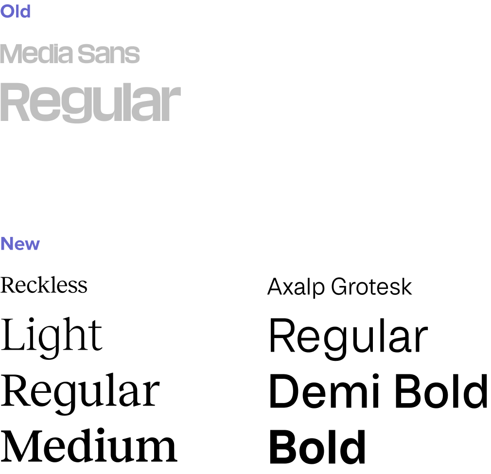
Typography
We looked for a serif + sans serif pairing that is sensible with attractive details. As an organization that celebrates and supports talents, we wanted to license from type foundries.
We find Reckless and Axalp Grotesk possess these qualities, with a wide range of weight and styles.
Color Palette
HFNM already has a color palette designed for print. It was the most compelling part of our identity and we’d like to continue utilizing it. We created the web color palette by modifying the existing one.

Buttons
The existing site did not have many buttons or links, and all of them have the same appearance. I created three styles to distinguish different purposes/actions. The rounded pill shape stands out among rectangular components.
My personal favorite is the text button featuring brackets that mimics the pill shape.

Wireframes
Creating wireframes may seem to contradict the point of having a UI kit. As a small organization, what we need is a compact set of UI elements that can be reused and repurposed. The process of creating wireframes helped us pare down the number of component styles.
Card Components
I narrowed down the component styles and left with three base styles: Box, Tabs, and Accordion. The card-style grouping makes content more scannable, which is a weakness of the existing site.
They are simple but customizable. We wanted to repurpose these components whenever we can. They make it easier to build new layouts and maintain in the future.

Spatial system
I used an 8 point linear scale for spacing and stacking elements, and a 4 point half step for icons and small text blocks.

component Variants
I designed border/no border variants of the Box, Tabs, and Accordions components. Bordered variants stand out on the page and separate themselves from other groupings. Variants without borders visually group with other components.
Box
Tabs
Accordion
Interactive element
From the beginning, we wanted to include a playful interactive element against the geometric and minimal design. The dev team created this subtle yet fun solution that applies to all hero images.

Other Components
There is still much to develop for it to be a well-rounded UI kit. I’m showing what has been built so far to launch the first phase of this web redesign.
Header & Footer & Nav

Column grid system
I used a 6-column layout for mobile and 3-column for web, and the aforementioned 8 point spacial system for stacking components.

Layout 1
This is a standard static page layout. It may include a Box or Tabs or two and Accordions along with a couple of images. The most important content will be in a Box or the first Tab.
Layout 2
Happy Family Radio is drastically different from the other content we worked on in this phase. It’s an example of repurposing components. The episode list is an Accordion. The two Boxes become a carousel on mobile.

Design Guidelines


Next Steps
As HFNM continues its transition, the website and design system are a work in progress. In the next few months, we plan on rolling out other content and features as we announce more programming. We’ll continue expanding on the UI kit to accommodate growth.
A sneak peek of what I’m currently working on: color themes for different content categories.
